Canada Energy Regulator
A Canadian Government Website redesign project focusing on synthesizing the IA, streamlining the navigation system and enhancing inclusive design.

OVERVIEW
The Canada Energy Regulator oversees the safe and environmentally sustainable development of Canada's energy resources, including oil, natural gas, electricity, and renewables, ensuring compliance with regulatory standards and fostering fair competition in energy markets through market monitoring and public engagement.
During our University of Toronto SCS UX/UI bootcamp project, our team of five product designers redesigned the Canada Energy Regulator government website, emphasizing enhancements to its information architecture and seamless integration of Canada.ca's design system, while also introducing inclusive design and accessibility features.
ROLE & DURATION
Product Designer
UX Research • IA • Visual Design • Prototype
April - May 2022

The Problem
Indigenous communities in Canada face diverse challenges stemming from government construction projects, affecting both their residences and means of living. They require a user-friendly and accessible government platform to effectively express their concerns and effortlessly access relevant information.


EMPATHIZE
EMPATHIZE
DESIGN THINKING PROCESS

User Research Summary
I contacted 20+ Indigenous community members through Facebook groups, indigenous community websites, and cold emailing, among whom 5 responded and agreed to my usability testing for the Canada Energy Regulator website.
I looked for government agencies for the redesign project that assist various communities in resolving issues affecting their livelihoods, and I came across the Canada Energy Regulator (CER), a federal agency responsible for the regulation of pipelines, energy development, and trade in the Canadian public interest.
Therefore, I decided to redesign the Canada Energy Regulator website to improve the user experience through accessibility enhancements, streamlined navigation, and a more inclusive environment for Indigenous communities.
Accessible and user-friendly government websites to access information and resources related to proposed or ongoing projects.
Ability to submit concerns or complaints about government projects.
Technical barriers for some users due to limited access to technology or digital literacy skills.
User Pain Points

DEFINE
DEFINE
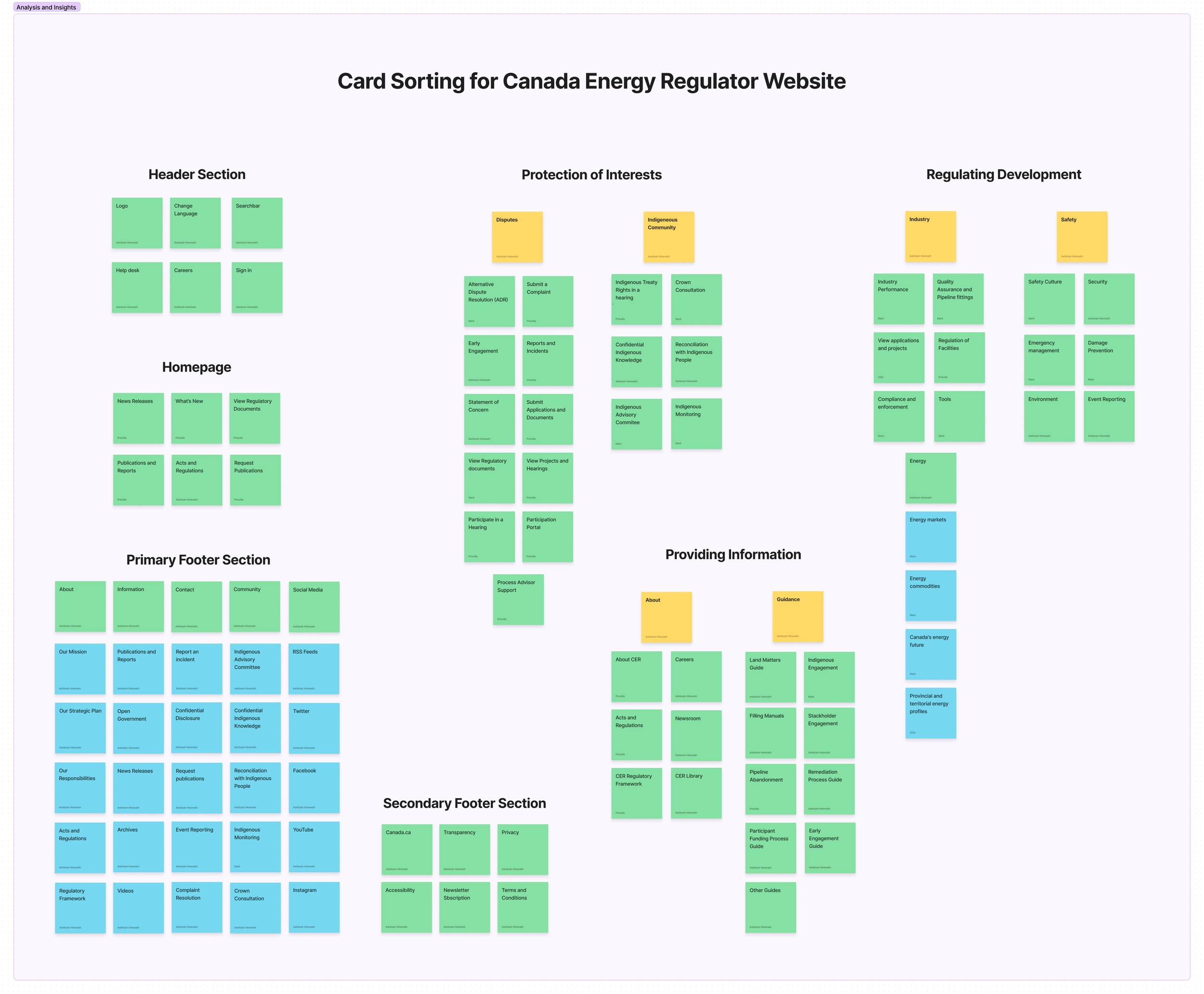
Card Sorting
My team and I conducted intensive analysis of the CER website's information architecture, utilizing card sorting to identify navigation issues, followed by brainstorming sessions via Zoom and FigJam to efficiently organize navigation menu items by grouping similar themes together for streamlining the navigation system.
User Persona


Usability testing revealed diverse user types with varying needs.
I synthesized insights to create multiple personas reflecting user descriptions.
Concentrating on the predominant persona helped me address their expectations effectively.
IDEATION
IDEATION

The Challenge
How might we improve the user interaction, the navigation system, and the classification of the information on the website so that the user can find relevant information with ease?
Design Guidelines & Research
Researched government website design parameters, focusing on the Canada.ca design system, and gained insights into design constraints and principles.
Drew inspiration from leading government websites like the United Kingdom Government Website, U.S. Small Business Administration Website, and U.S. Department of State Website, studying their navigation systems and adherence to strict design rules.
Applied knowledge to enhance user experience (UX) by designing within established design systems, leveraging principles learned from extensive research on government websites.

The Solution
Our team's redesign of the Canada Energy Regulator website prioritizes enhanced user experience, ensuring ease of navigation and accessibility for individuals of varying technological competencies.
By implementing intuitive design principles and optimizing information architecture, the revamped website facilitates seamless access to relevant information, empowering all users to engage effectively with regulatory processes and access critical resources on the website.
LOW-FI WIREFRAMES
LOW-FI WIREFRAMES

Desktop Navigation Menu 1

Desktop Navigation Menu 2

Desktop Navigation Menu 3

Mobile Hero Section Homepage
Mobile Cards Section

Mobile Menu Section
HI-FI WIREFRAMES
HI-FI WIREFRAMES


Accessibility
Accessibility
Text Resizer for easy Readability
Color usage inline with the Accessibility Checker AODA and WCAG Compliance
Dark Overlay behind Text for Accessibility
No Animations - Buttons for Movement
Used Alt text for Images
All contents can be accessed with keyboard alone.
PROTOTYPING
PROTOTYPING
TESTING
TESTING
Improvements
1. Using Visual Hierarchy technique, I redesigned the Search button on the Home Screen

Search Button on the Home Screen
2. Redesigned the search button on the Search Screen to highlight that it is clickable.

Search Button on the Search Screen
Learnings & Takeaways
Prioritizing accessibility in web development for inclusivity.
Recognizing the significance of information architecture for user navigation.
Conducting intensive user research to inform design decisions for enhanced UX.