
DreamTeam
How I Improved University Group experiences by Addressing Inequities and Streamlining Collaboration.
Team: 4 Members
Type: UI Redesign
Design Systems
Timeline: 8 weeks
Miro
Figma

The Timeline
The project unfolded over a span of three months, broken down into distinct phases:

The Problem
University students face frustration with group assignments due to uneven distribution of tasks, lack of transparency in individual contributions, and difficulties in managing team collaboration effectively.

Roles and responsibilities
Conducting User Research : To identify pain points in group assignments in academic settings.
Designing the User Interface : Focusing on enhancing collaboration and accountability.
Performing Usability Testing: Iterating on the design based on usability testing and user feedback.
Creating Interactions: To develop interactions for enhancing the user experience.
scope and constraints
The scope focused on creating an intuitive platform for managing group assignments, with an emphasis on enhancing collaboration and accountability. The constraints included time limitations and the need to address diverse student needs.
SCOPE
To design a user-friendly interface for students with hectic academic schedules.
To prioritize use cases like tracking group progress, individual contribution, and collaboration.
Creating features that cater to both individual and group needs in academic group settings.
CONSTRAINTS
Limited time to conduct extensive user testing and iterations.
Balancing the needs of diverse user personas with differing levels of technical proficiency.
Design the app with a mobile-first approach, focusing only on mobile devices.
DESIGN PROCESS RATIONALE
design thinking
double diamond process
I chose the Double Diamond process over Design Thinking due to these 3 compelling reasons:

Application 🧑🏻🎓
Double Diamond’s detailed approach is ideal for crafting a robust tool for group project management, while Design Thinking is better for early-stage innovation and user needs understanding.
Focus 🎯
DreamTeam aligns better with the Double Diamond process due to its focus on complex, well-defined issues, whereas Design Thinking is better for ambiguous or less defined problems.
Approach 🛣️
The structured approach of Double Diamond process offers clear stages for problem exploration before solution development, unlike the iterative and flexible nature of design thinking methodology.
User Research
PRIMARY RESEARCH
I conducted 1-on-1 interviews with 5 users, comprising 5 students at Toronto Metropolitan University, Toronto, to explore their experiences with group assignments.
SECONDARY RESEARCH
In my secondary research, I identified three key gaps among competitors like D2L, Blackboard, and Canvas. These gaps highlight areas where current solutions fall short.
RESEARCH GOALS
Identify common challenges in student group work, such as uneven contributions and communication barriers.
Understand user expectations for a group assignment management tool, focusing on collaboration, accountability, and ease of use.
Evaluate existing solutions to identify gaps and opportunities for improving the group project experience.


how might we
Improve group assignment experiences for university students by addressing uneven task distribution, enhancing transparency in individual contributions, and streamlining team collaboration?
Concept Development
To address the gaps identified from competitor findings, my solution involved creating a comprehensive user flow that simplifies task management, enhances transparency, and streamlines collaboration.
These user flows will detail each step and touchpoint, ensuring that users can easily navigate tasks, track contributions, and communicate effectively within the platform.
Addressing Gap 1: Simplified Task Allocation
Allows users to assign tasks quickly and easily, optimizing workflow within group assignments.
Addressing Gap 2: Comprehensive Tracking
Provides an overview of each member's progress, ensuring transparency and accountability.
Addressing Gap 3: Effective Communication
Facilitates seamless interactions between team members, improving coordination and collaboration.
ideation
Based on the research, three wireframe options were designed to address the identified pain points for the home screen:
Option 1
Reminders: Quick access at the top.
Assignments & Tasks: Upcoming items listed below.
Navigation Bar: Track progress and manage projects/teams.
Option 2
Search Feature: Quickly find assignments, courses, and tasks.
University Events: Upcoming events displayed below.
Tracking Tools: Manage classes and tasks efficiently.
Option 3
Home Screen: Clean, minimalistic design with key elements at the top.
Assignment Details: Displayed at the bottom.
Bottom Navbar: Access calendar, planning tools, and subjects.
the winning concept hunt
I presented the three home screen options to four of my target users. They preferred Option 1 for several reasons:
Immediate Visibility: Reminders at the top ensure important deadlines are seen right away.
Clear Layout: Upcoming assignments and tasks are easily visible, helping with organization.
Progress Tracking: Home screen cards allow users to monitor their progress and stay motivated.
Easy Project Creation: The bottom navigation bar simplifies starting new projects or teams.
User-Friendly Design: The intuitive layout balances functionality with simplicity, making it accessible and easy to use.
From paper to figma
After selecting the winning concept, I began wireframing the main screens of DreamTeam, including the (left to right) home screen, chat list screen, bottom nav bar overlay, individual tracking screen, primary chat screen, and onboarding screen.
Design Rationale: The What and the why
The design rationale for DreamTeam prioritizes usability and engagement, with each element—color scheme, typography, icons, illustrations, and layout —carefully selected to enhance the student experience. Here's a brief overview of the key design choices.
-
Blue was chosen based on color theory for its associations with trust, reliability, and professionalism—qualities ideal for an academic tool.
The dark mode reduces eye strain for students working long hours, particularly at night, creating a more comfortable and focused viewing experience. -
Urbanist, a modern sans-serif typeface, was selected for its clean lines and high readability.
It ensures clarity, which is essential for students working on detailed assignments and academic tasks. -
A mix of icon styles—bold for key actions, light for secondary actions, curved for friendly elements, and two-tone for contrast—creates a clear visual hierarchy.
These diverse icons help users navigate efficiently and identify important functions. -
Onboarding illustrations offer a welcoming introduction to the app, explaining key features in a visually engaging way.
They help users understand the app's benefits and functionality from the very beginning. -
The bottom navigation bar focuses on key features like "Home," "Assignments," and "Notifications" for easy access.
The clean home screen layout and task-focused design streamline the user experience, enabling students to manage their work efficiently.
Usability Testing
I conducted moderated usability testing sessions remotely through Zoom. These were the key changes implemented based on usability testing findings.
The Solution
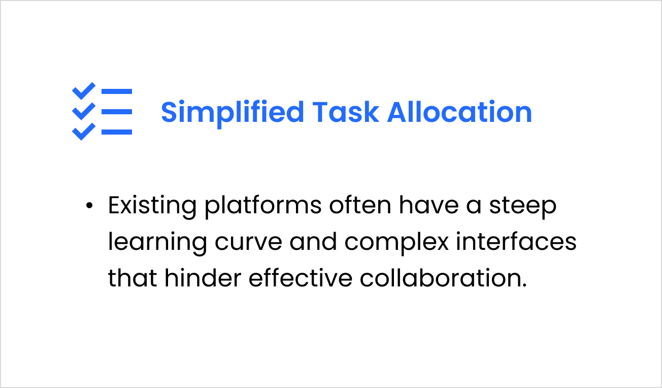
1. Simplified Task Allocation
Streamlines the process of assigning tasks, ensuring that workload distribution is clear and equitable for all team members.
2. Comprehensive Tracking
Provides real-time progress updates and individual task tracking, making it easier to monitor contributions and stay on schedule.
3. Effective Communication
Integrates seamless communication tools within the app, enabling team members to collaborate and resolve issues quickly without needing external platforms.
outcomes
Designed an app that streamlines group assignment management, allowing students to track tasks, monitor contributions, and enhance accountability.
Successful usability testing led to refined features, such as simplified task allocation and a more intuitive homescreen.
lessons
Clear communication and accountability are essential for effective collaboration, and tools that address these needs must be simple and user-centered.
Structuring complex problems using methods like the Double Diamond framework ensures thorough exploration and refinement of solutions.